*Video transcription provided below*
Hi, I’m Nathan Lomas,
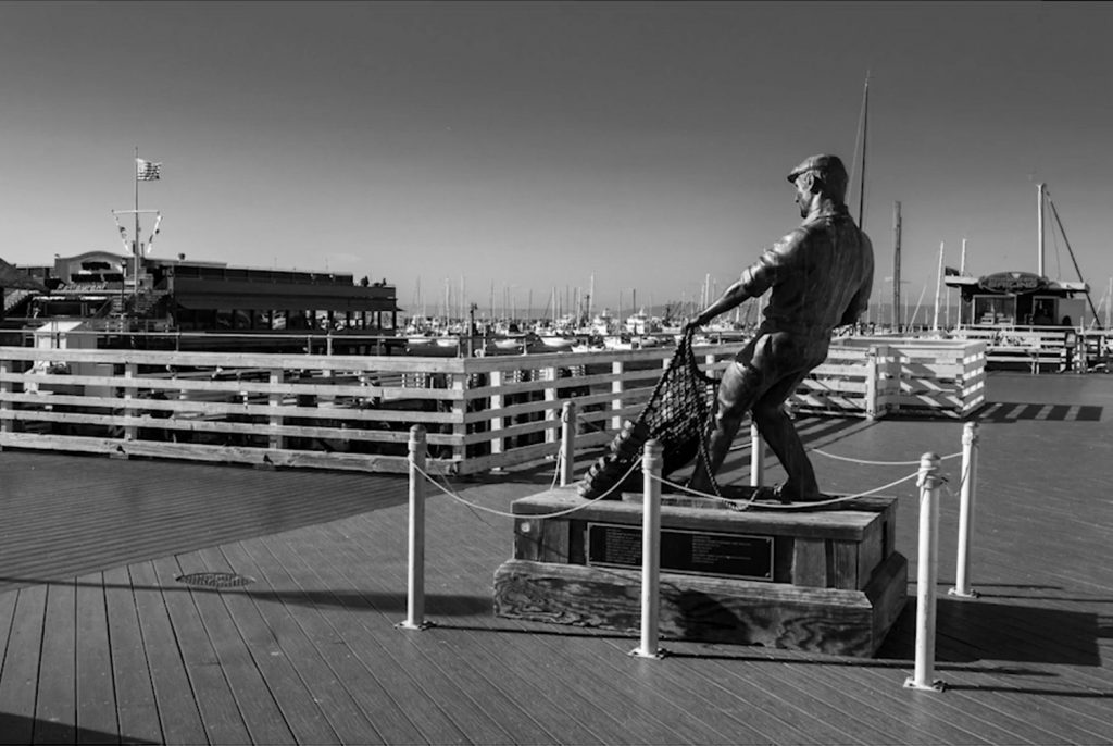
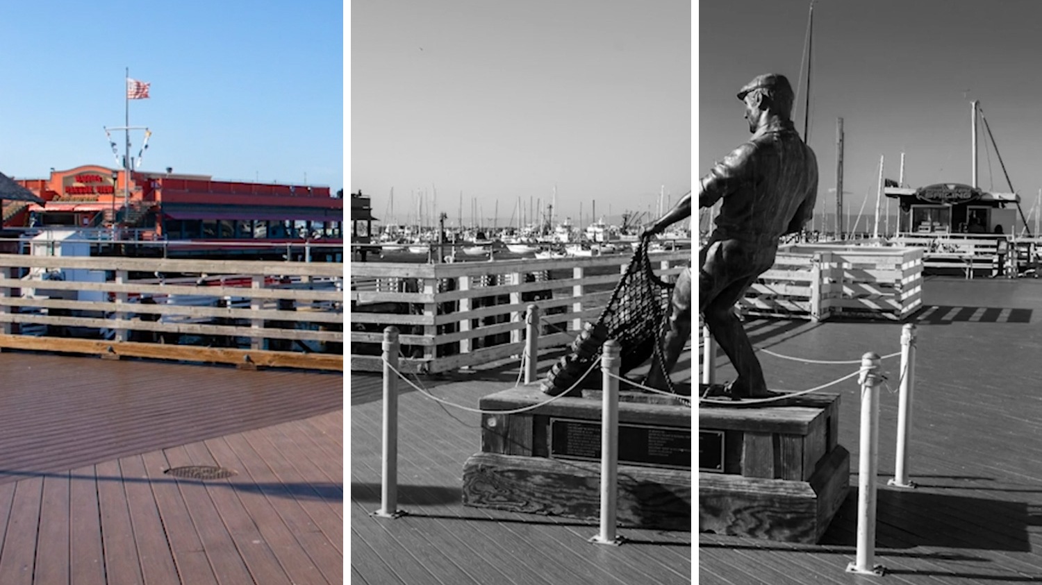
Today we’re going to discuss converting an image to Black and White in Adobe Lightroom Classic. Right now, I am in Adobe Lightroom Classic with an image that I would like to turn Black and White. I’ve already done a few basic adjustments to get better tonality and get a little more contrast into my image.
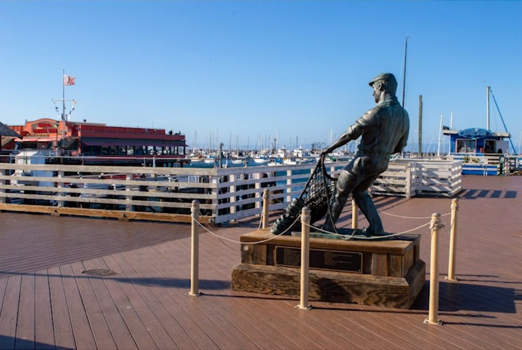
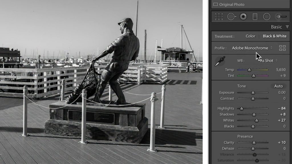
Next, I’m going to go to under the Basic Panel in Lightroom in the Develop Module. Here we find our Profile Selector, and I’m going to change it from Adobe Color to Adobe Monochrome. The Profile Selector contains a number of different interpretations of your image that you can change at the outset. If you want to work in Black and White, generally the most advisable one is Adobe Monochrome.
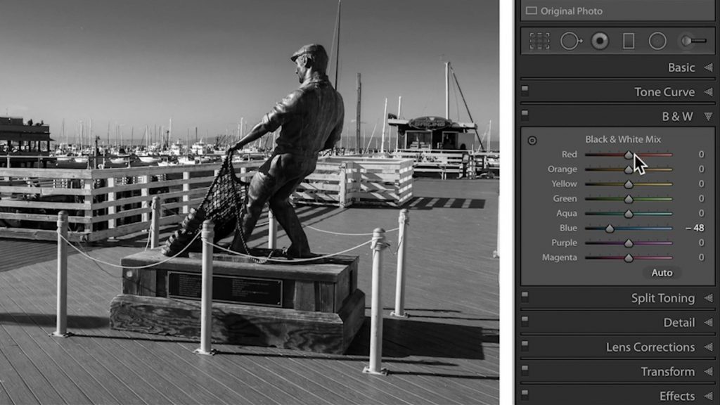
Next, I am going to go down to what was previously called the HSL Panel—when you’re in a monochrome profile it’s called Black and White (B&W). If I open this panel we can see that it has all these different color ranges (or color sliders) that I can start to control. I know that my original color capture had a very blue sky. If I grab the blue slider and bring that down to the negative side we can see very quickly that it’s grabbing everything that is identified as blue within the frame and darkening it down so I can get a little bit more drama happening in the sky.
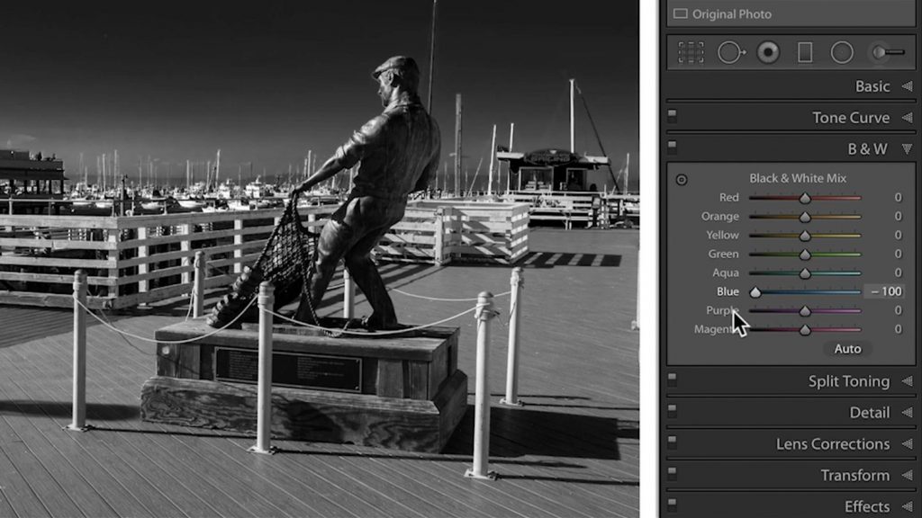
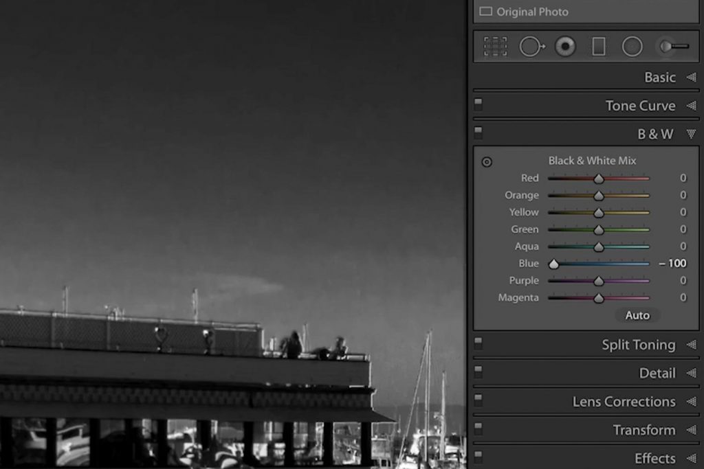
Be careful not to go too far. If you go too far you start to see some blockiness issues and some muddled tones. These sliders should be used with caution, but they can create an effect that gives the image a little more character.
I probably have some oranges and reds in here—it comes down to moving things around and seeing what you can get to happen—maybe I want to lighten those up for a little more contrast. I probably have some aqua here that I can play with in the sky. Some red perhaps in that wood in the dock—maybe I’ll make those little darker so that these other lighter tones standoff of that.
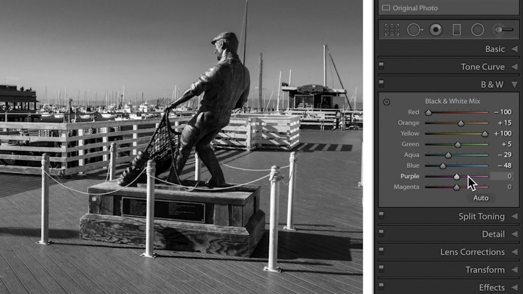
Let’s see if there’s any green in here as well (not really). The success or failure of this technique really depends on whether or not you have these tones available in your original color capture. So if you don’t have a color that’s present here not much is going to happen.

Now we can see if I turn off my Black and White Mix—here it was Before, when we initially converted to black and white and then After, I’m able to get a lot more a unique blend of tonality by using the underlined color that was in the initial capture.
